 Skip to content
Color Contrast in Flooring: Enhancing Safety in Memory Care Units
When it comes to designing memory care units, every detail matters. These spaces require thoughtful consideration to ensure they are safe, welcoming, and functional for residents with cognitive challenges. One aspect that often gets overlooked is the flooring. Specifically, the role of color contrast in flooring can significantly enhance safety and navigation for residents. Let’s dive into how strategic color choices can make a world of difference.
The Importance of Flooring in Memory Care Units
The environment plays a critical role in the well-being of individuals living with memory-related conditions such as Alzheimer’s or dementia. Flooring, as a fundamental component of interior design, can greatly influence the experience of these residents. A well-chosen floor can help prevent falls, reduce anxiety, and promote independence.
Imagine walking into a space where the floor, walls, and furniture all blend into one. It would be disorienting, wouldn’t it? For individuals with memory impairments, this sensation can be even more pronounced. That’s where color contrast comes in. By using contrasting colors, you can create clear visual boundaries that guide residents and help them feel more secure in their environment.
Understanding Color Contrast
Color contrast refers to the difference in color that makes an object distinguishable from another. In memory care settings, it’s crucial to utilize this concept to enhance visibility and minimize confusion. High contrast flooring can help residents differentiate between different areas, such as transitions from hallways to rooms or from communal spaces to private areas.
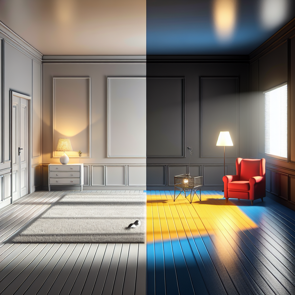
For example, a dark border around a lighter flooring can signal the edge of a room or a change in elevation. This simple contrast can act as a visual cue, reducing the risk of trips and falls. Moreover, color contrast isn’t just about safety; it also plays a part in making the environment more engaging and stimulating.
Choosing the Right Colors
When it comes to selecting colors, it’s essential to consider both aesthetics and functionality. Warm, inviting colors can create a homely atmosphere, but they should also be balanced with contrasting hues to ensure clarity and safety. Here are some tips for choosing the right colors:
1. Use Complementary Colors: Complementary colors are those opposite each other on the color wheel, such as blue and orange or red and green. These combinations create a strong visual contrast, making them ideal for defining spaces.
2. Consider Light Reflectance Values (LRV): LRV measures the amount of light a color reflects. In environments for those with vision impairments, using flooring with high LRV can enhance visibility. Pairing a high LRV floor with a low LRV border can clearly define edges and transitions.
3. Avoid Busy Patterns: While patterns can add interest, overly complex designs might confuse or overwhelm residents. Opt for simple patterns with clear contrast to keep things straightforward.
Impact on Resident Well-being
Beyond safety, thoughtful flooring choices can have a profound impact on the mental and emotional well-being of memory care residents. By creating a visually distinct and comprehensible environment, residents can navigate their surroundings with greater confidence and less frustration.
Additionally, colors have psychological effects. Soft greens and blues can evoke calmness and serenity, while brighter hues like yellow can stimulate alertness and mood. By incorporating these insights into flooring design, caregivers can create spaces that not only protect but also nurture residents’ spirits.
Case Studies and Success Stories
Several memory care facilities have already embraced the power of color contrast in flooring with impressive results. For instance, a facility in California redesigned its common areas using high contrast flooring. They reported a notable decrease in fall incidents and an improvement in residents’ ability to navigate the space independently.
Another facility incorporated color-coded pathways to guide residents through different zones, such as dining, recreation, and rest areas. This system not only improved safety but also enhanced residents’ sense of autonomy and engagement with their environment.
Conclusion
In the realm of memory care, every design choice can have a significant impact on the quality of life for residents. Color contrast in flooring is a simple yet powerful tool to enhance safety, improve navigation, and support the overall well-being of individuals with cognitive impairments. By prioritizing these considerations, caregivers and designers can create spaces that are not only safe but also comforting and affirming. 🏡
As we continue to learn more about the needs of those in memory care, innovations like these remind us of the importance of empathy and attention to detail in caregiving environments. So, next time you’re involved in the design of a memory care unit, remember: a little color contrast can go a long way! 🎨
Call Us Now!